
Best Blue Paint Colors You Probably Haven’t Heard About

When it comes to transforming your home, paint is one of the biggest tools of the trade. The color blue is one of my favorites, which is no secret if you follow me on Instagram! I’ve tried many gorgeous blue paint colors in my own home and for clients alike. And now, I’ve narrowed down the best blue paint colors you probably haven’t heard about!
Blue might just be the most versatile shade on the color wheel; it pairs so beautifully with other colors like jewel tones or neutrals that you just can’t go wrong with it. From rich sapphire tones to add a dash of drama to mid-toned nautical blues, let’s take a look at some of the most universally appealing popular blue paint colors.
Motor City by Clare Paint
I used this calming, light gray-blue in my dining room called Motor City by Clare Paint, and it is such a pretty light blue. It’s easy on the eyes and has cool undertones with the slightest hint of green. It’s modern, it’s refreshing, and it’s a great way to segue into blues if you’re more of a white or gray walls kinda person. One thing to note, the formula by Clare Paint is unmatched, it goes on like butter!


Shop my dining room
Berrington Blue by Farrow and Ball
Not for the faint of heart, but a real strong mid-toned blue, Berrington Blue by Farrow and Ball has the perfect historic look to it. You’ve probably heard of Oval Room Blue by Farrow and Ball, so think of this as the older, more glamorous cousin to that color. It has a fairly high dose of black to it, but still makes for a comforting blue to retreat to. I’ve used it in Eesa’s nursery and paired it with Duck Green on the ceiling, also by Farrow and Ball.


Shop Eesa’s nursery
Blue Dusk by Benjamin Moore


What a stunner this office is, clad in Blue Dusk by Benjamin Moore from top to bottom! A muted ocean blue with gray undertones, this blue is a safe bet for all spaces. I wouldn’t hesitate to use it in a larger room because it’s so universally flattering.
The funny thing is, using it in a tiny space like this home office actually makes the room appear larger. Love the drama of painting all walls and the ceiling the same color.
Providence Blue by Benjamin Moore
This gray-blue is actually very similar to Blue Dusk, but Providence Blue is a slightly darker, less in-your-face blue. If a moody vibe is more your thing, I highly recommend Providence Blue by Benjamin Moore. I think it has a bit more green to it than Blue Dusk.
I used it in a semi-gloss finish in my laundry room, and it looks like such a glamorous nook to be in. I would easily pair this blue with any metal like polished nickel, black, or even aged brass.

Shop my laundry room
Silent Night by PPG
Last but definitely not least, we have the darkest of my top 5 blue paint colors, Silent Night by PPG. Even though it’s the darkest blue I have on this list, this loft I designed still looks light and airy. By keeping the ceiling white, light bounces off it and creates fewer shadows. So if you’re looking to try a dark blue on your walls, this is a great designer tip, so you don’t lose all the light in the room. Rich and jewel-toned, this deep blue paint color is sure to be a crowd pleaser!

Shop the loft
Water’s Edge by Benjamin Moore
Water’s Edge is one of those soft, in-between shades that feels calm without being boring. It’s a muted blue with just enough gray to tone it down and a tiny whisper of green that adds a little depth. If you like blue-gray paint colors but want something a little fresher and more serene, this one is a great choice.
In bright rooms, it looks like a misty sky. Soft and airy with a quiet, relaxed feel. In spaces with less light, it leans a bit more gray, which gives it a moody elegance. I especially love this color for a laundry room, a cozy dining nook, or even an accent wall in a living room with a lot of natural light.
It pairs beautifully with crisp whites, warm wood tones, and brass accents if you’re going for that modern European feel. Definitely one of the best blue paint colors and a perfect option if you want something timeless but a little different from the usual.

Fariha’s Design Tips
If you’re not ready to embrace a whole room painted a dark color, keep the ceiling white and use the dark tone only on walls to keep it looking bright.How to Pick the Right Blue for Your Room
Choosing the best blue paint color starts with knowing what your space needs. The light in your room plays a huge role in how a color will look once it’s on the walls. North-facing rooms tend to cool things down, so a soft blue-green or warmer gray-blue might balance that out. On the flip side, if your space gets a ton of natural light, like an east- or south-facing room, cooler blue tones will feel fresh and vibrant without looking icy.
The size of your room also matters. In smaller rooms or dark rooms, pale blue tones and soft blue-grays can make everything feel a bit more open. If you’re painting a large living room or a dining room that needs a focal point, you can definitely go bolder. Deep blue, navy, and even moody blue-gray paint colors work beautifully when paired with crisp whites or warm wood tones. And if you’re still unsure, grab a few color samples. Testing paint colors on your actual walls, at different times of day, is the best way to avoid surprises.
Blue is one of those colors that lives beautifully across all design styles. Whether you’re going coastal, modern, traditional, or something more eclectic, there’s a blue out there that will work. You just need to find the right tone for your lighting and layout.
Where to Use Blue Paint in Your Home
Blue is one of the most versatile interior paint colors, and it works in almost every room. In fact, I think blue hues bring calm and sophistication wherever they go. If you’re just getting started, try painting a laundry room or a powder bathroom. These smaller rooms are great for experimenting with a fun pop of color, and they’re less intimidating than painting an entire living room or open-concept space.
In a dining room or home office, blue walls can be a beautiful backdrop for brass accents, wood furniture, or built-in shelving. A lighter shade brings an airy feel, while darker shades add drama and elegance. These deeper blue tones look amazing paired with antique art or statement lighting.
In the kitchen, blue is a great choice for an accent wall or even a kitchen island. I’ve seen classic navy work beautifully with marble counters and shaker cabinets. And if you’re considering blue for the exterior, many Benjamin Moore blues are vinyl safe and approved for exterior wood stains. It’s a subtle but high-impact way to update your curb appeal.
Don’t forget front doors. A fun blue front door makes a big statement, especially with brass hardware and white trim. It’s an easy way to elevate your entry without repainting your entire home.
Room by Room Blue Paint Ideas
Choosing a blue paint color can feel like a huge decision. Undertones, lighting, and the mood you want in each room all play a role. So here’s how I’d use each of my favorite blue paint colors throughout the house, based on how they worked in my own home.
Dining Room
Motor City by Clare Paint is what I used in our dining room, and it has such a calming, soft presence. It’s a gray-blue with a hint of green that works beautifully with warm woods and neutral decor. This one is a perfect pick if you usually lean toward white or gray walls but want to dip your toe into color. I love how it sets the tone for cozy dinners without feeling too formal.
Nursery or Kids Room
For a bold but classic look, Berrington Blue by Farrow and Ball is the one. I used it in Eesa’s nursery and paired it with Duck Green on the ceiling. It feels a little vintage and a little dramatic in the best way. If you’re familiar with Oval Room Blue, this one is a touch deeper and feels a bit more grounded. It’s one of those colors that gives character without needing much else.
Home Office
Blue Dusk by Benjamin Moore completely changed the vibe in a small office I worked on. I went all in with the color on the walls and ceiling, and it created such a cozy, focused space. It’s muted enough to feel neutral but still rich with personality. Even in a tiny room, it made the space feel more expansive.
Laundry Room
Providence Blue by Benjamin Moore is the blue I used in our laundry area, and it’s everything. It has a slightly deeper tone than Blue Dusk with just a touch of green. I used it in a semi-gloss finish, which gave the room a polished look without going too bold. It pairs really well with metals like polished nickel and black, and it made even laundry feel a little luxurious.
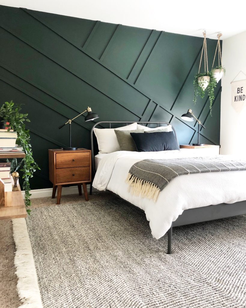
Living Room or Loft
Silent Night by PPG is the deepest of the blues I’ve used, but it still feels soft and balanced. I used it in a loft space with white ceilings to bounce more light around the room. It’s rich and saturated but still lets the space breathe. If you’re craving a dramatic blue that doesn’t overwhelm, this is a great one to try in spaces with natural light.
Before you commit to any color, always sample it first. Paint a piece of foam board with two coats and move it around the room at different times of day. This will help you see the true tone in both natural and artificial light before making your final decision.
I hope this helped narrow down your search for the best blue paint colors. Choosing a paint color can feel like a huge decision, but it doesn’t have to be stressful. Whether you’re drawn to a soft and airy shade like Motor City or something dramatic like Silent Night, there’s a blue that will bring your space to life.
My biggest tip? Always test the color on your wall first. The amount of light in a room, the direction your windows face, and even your floors can completely change how a color reads. Try it out at different times of day and live with it for a bit before you decide.
These are the blue hues I’ve personally used and loved in our home. Each one brings a different mood, and I hope they give you some inspiration for your own space. If you end up trying one of them, let me know in the comments or tag me—I’d love to see how it turns out.
If you are interested in other paint colors I’ve used in my home, download my free whole-house paint guide here.
Green colors more your thing? Great! I have a whole post on my top 5 green paint colors here.


This post contains affiliate links to products that I used or recommend. If you purchase something through an affiliate link, I may receive a small percentage of the sale at no extra cost to you. I really appreciate your support!


3 comments
I was wondering why you mentioned Waters Edge in the copy and in the living room example but then in the top five you listed Silent Night as your living room pick, which was not even mentioned in the article, whereas Water’s Edge was not mentioned as the top five or in the paint swatches at all. Was this a typo? I really liked the picture of what you said was Waters Edge but now I’m wondering if that was actually Silent Night? Thanks!
Hi! So sorry about that – water’s edge was actually missing a photo which I just added now. It’s the one with the half wall painted. It was added as a later update to the blog post!